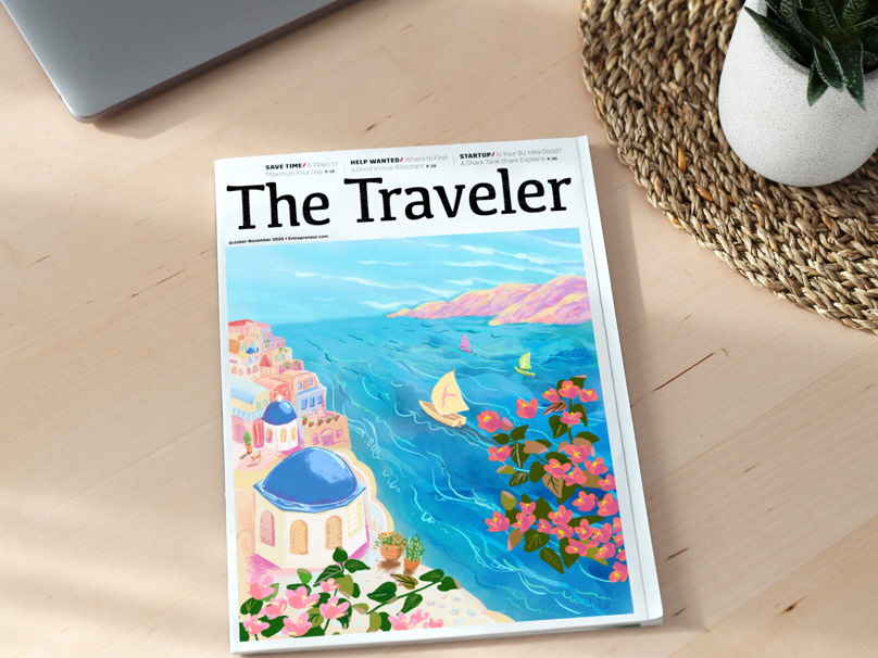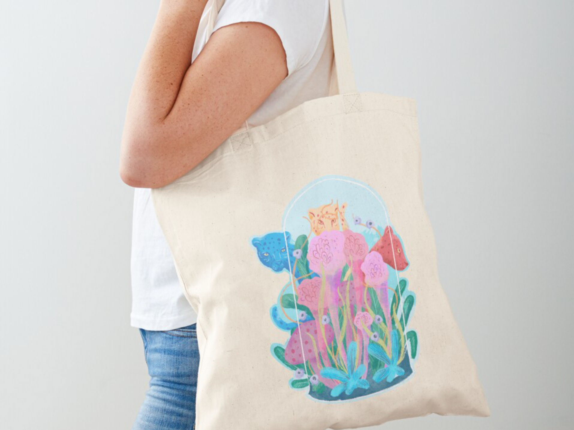
When I started working on this illustration, my goal was simply to explore color and create a small travel-inspired scene. I just wanted to capture the warmth and joy of a Mediterranean summer afternoon in a place I’ve never visited before, in my style with painterly textures that make the artwork feel handcrafted.
As the project evolved, I realized it was asking to become something more. I kept wondering: How could I introduce movement, excitement, and a sense of wonder into this quiet moment? And how could this hint at a larger story?
One question shifted the entire direction of the project: How can I create a scene that people would want to explore?
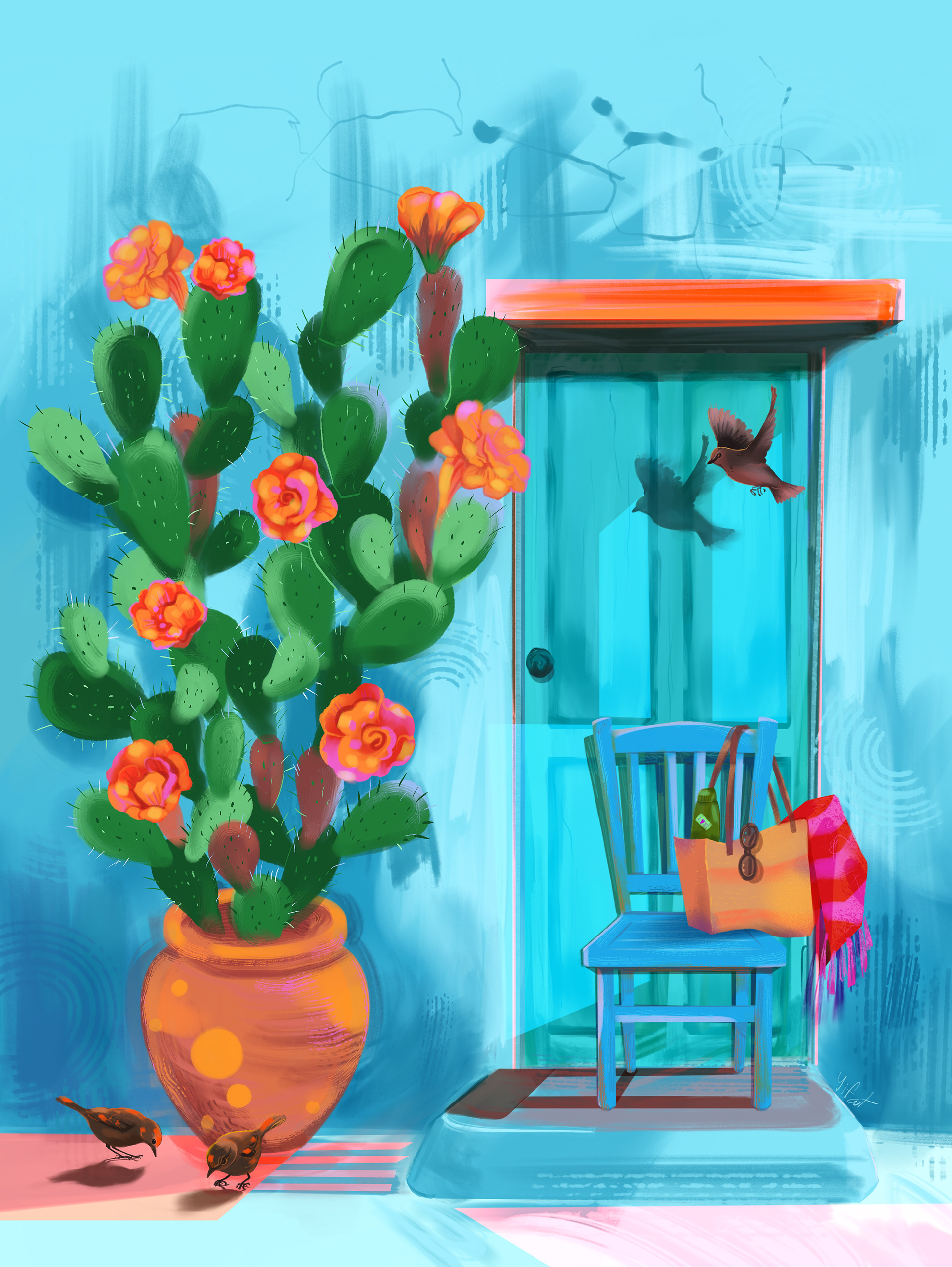
Original illustration
From there, I tested how typography could become part of the illustration, weaving the title into the artwork so it felt like another visual element that complemented the composition while remaining bold and readable at thumbnail size.
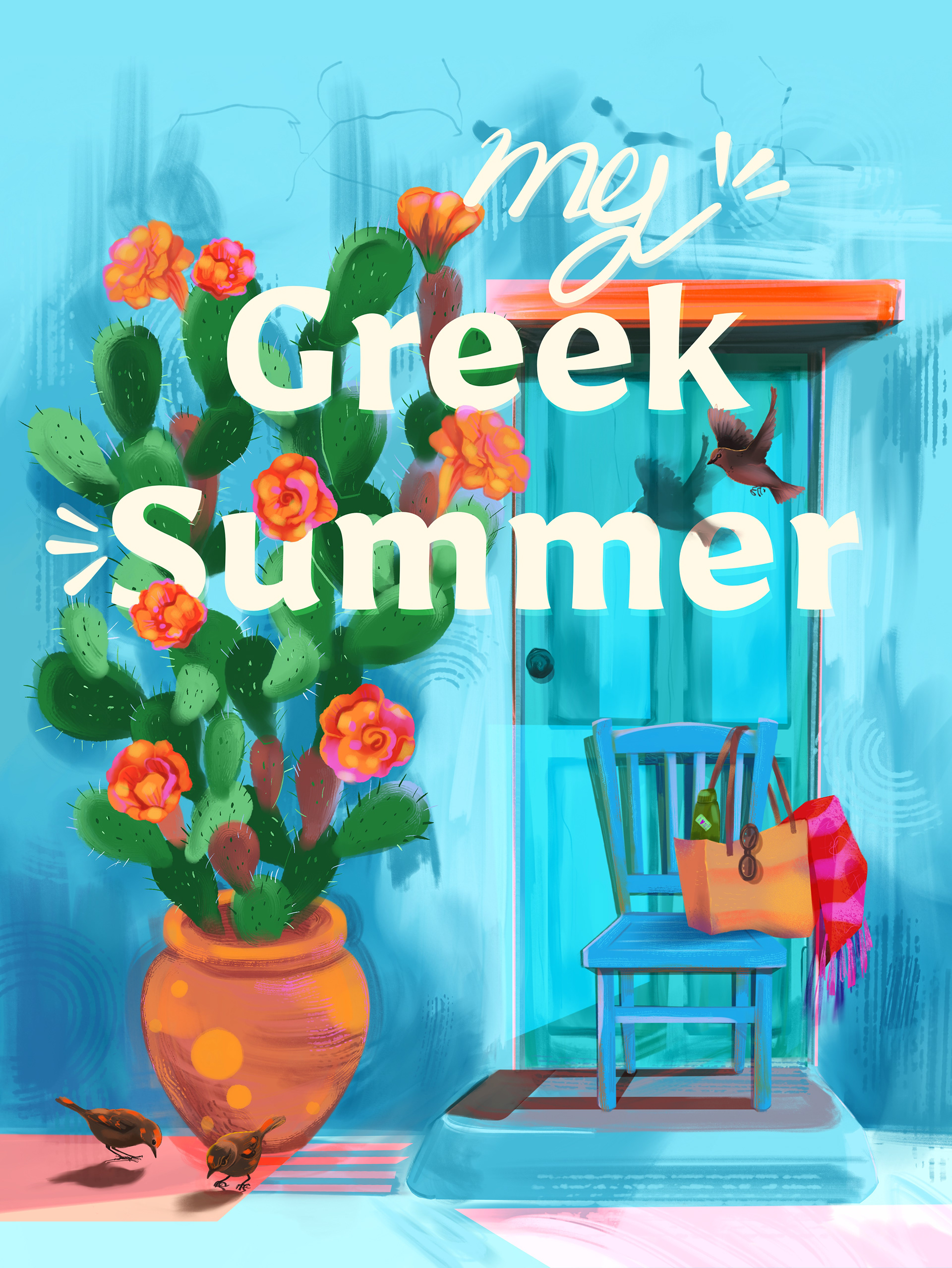
Illustration with typography
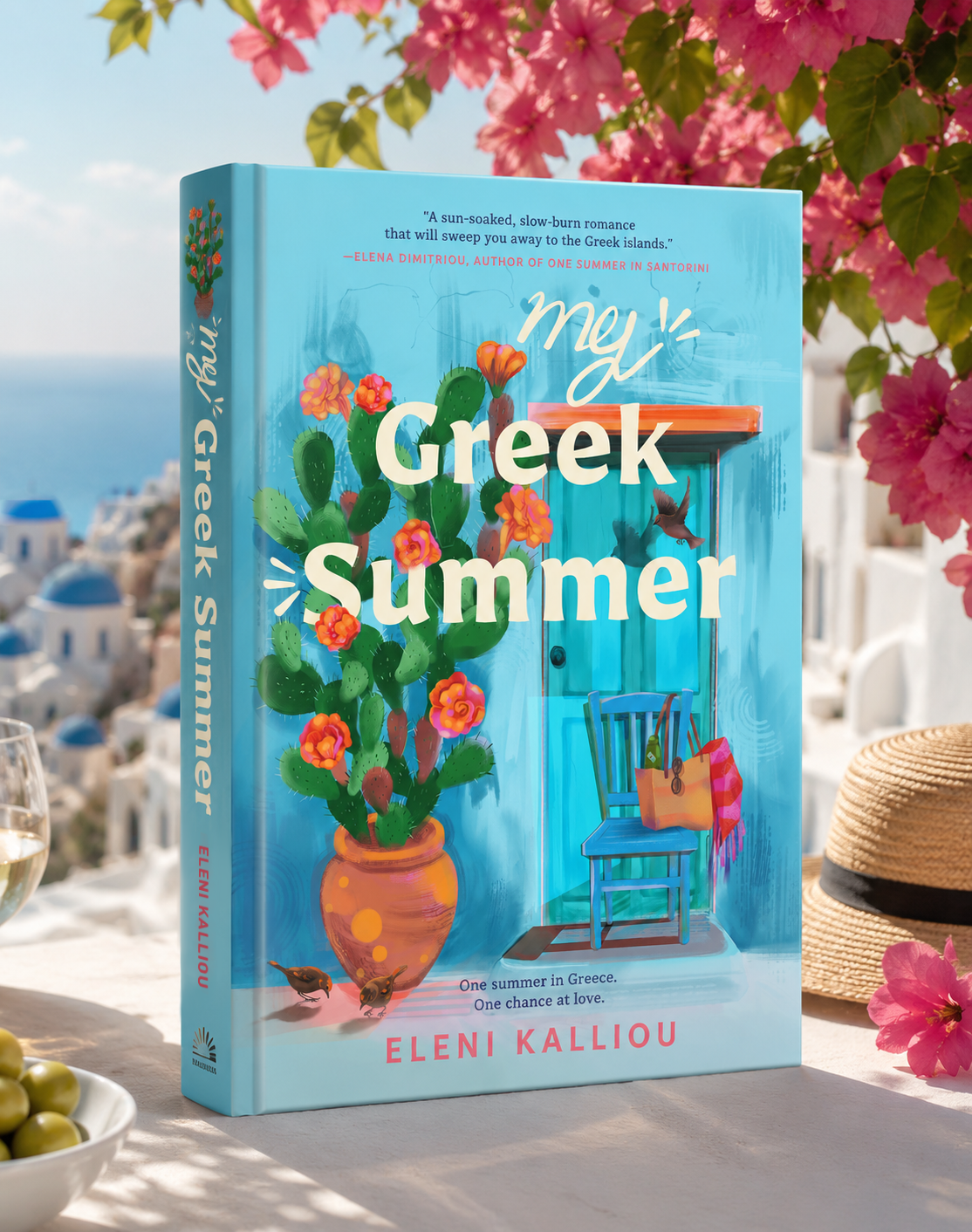
Once the illustration felt complete, I wanted to try it out on a book cover. My Greek Summer has a commercial appeal for the women’s fiction/romance market.
The cover art invites the questions:
Who owns the chair?
Who left the beach bag?
Why is the door closed?
Is someone arriving…or waiting?
Next, I created mockups of the published novel placed in different settings.
Seeing the illustration in context helped me evaluate not only the artwork itself, but also how it could connect with readers and communicate the mood of the story at first glance.
I created a series of mockups that imagined the book as a published novel: From a romantic Greek island setting to a bookstore display.
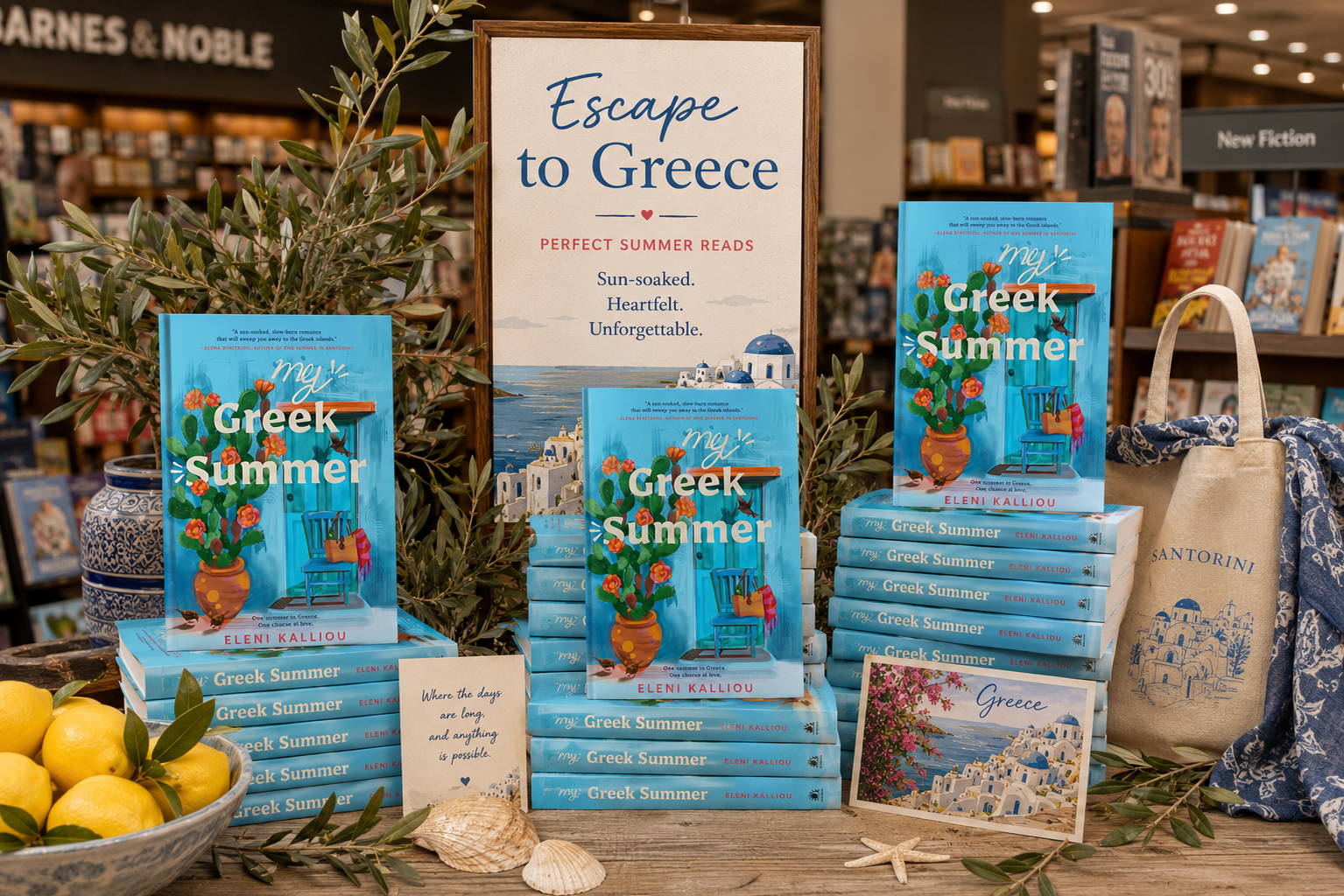
A marketing mockup with the books on a front table display in a Barnes & Noble store.
… And through a seasonal publishing marketing campaign.
I loved exploring how a single image can spark someone’s imagination before they’ve read the first page!
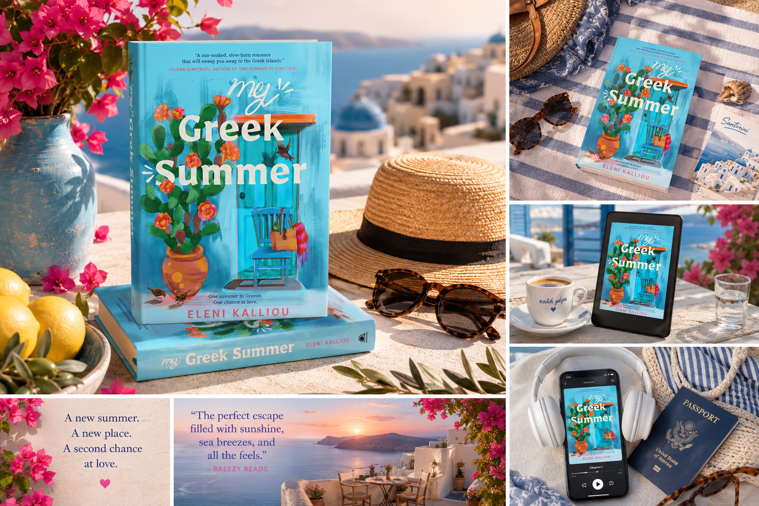
Publisher-style campaign with hardcover, paperback, Kindle version, audiobook cover, social media ad, and “Book of the Month” promotional images.